What Makes an Amazingly Successful Landing Page
More businesses are holding events than ever before. Technology and a global pandemic have made it a requirement that we learn how to navigate different ways of connecting with each other that build and strengthen relationships regardless of where in the world we are.
Not all events have to be market or client-focused events like conferences or workshops. Events can also include team meetings, department trainings, or gatherings to bring employees together from different locations. Regardless of the type of event that you are holding, how you convey that information on your site can make or break the success of the event. There are also some differences in the effectiveness of presenting that content for virtual events versus in-person events. At least that is what a recent study by Splash has discovered.
Omicle has worked with many clients on organizing and promoting a variety of events. So, we understand the importance of event design to ensure that an event is successful. The other thing you’ll notice is each of these tips can also be applied to your website and product or service landing pages.
1. Create a Landing Page that Converts
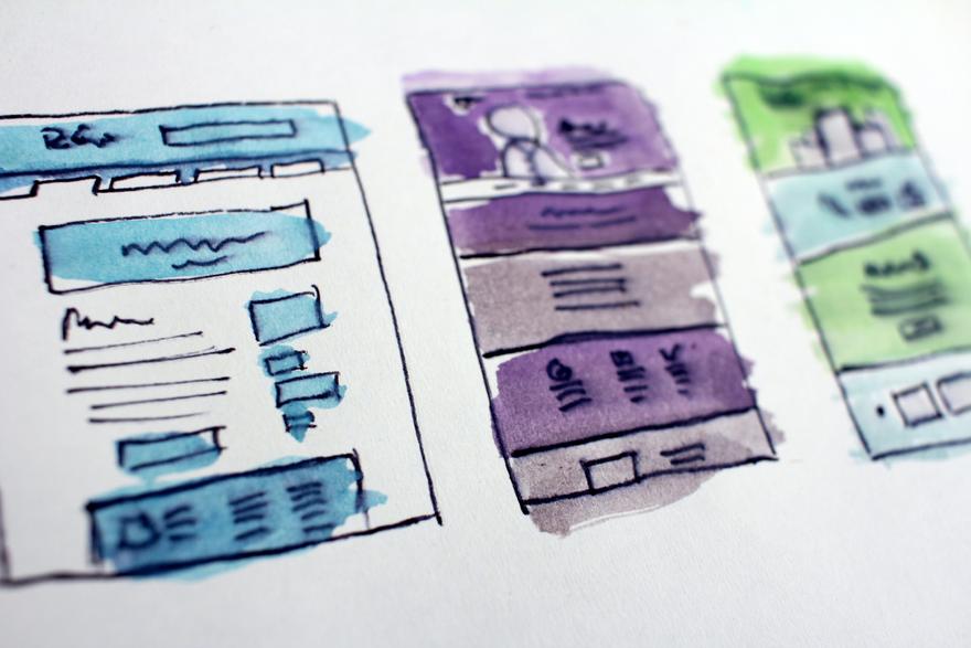
Your event landing page sets a tone. It plays an important role in establishing an easy-to-use and easy-to-navigate experience. Remember, the easier it is to do business with you, the higher your conversion. There are four elements of your landing page that are important: sections of content, font, colors, and buttons. Let’s look at each of these.
Sections of Content. The average number of content sections on the landing page should be between 5-7. Post-pandemic, virtual events come in at the lower end and in-person events come in at the upper end. I suspect this range will stay even as more events become hybrid. Remember, keep your content to the point, easy to understand, and relevant.
Fonts. Ok, this may get a bit technical for some. Don’t worry your web professional will understand. According to Splash, the median event title size was 2.8 rems, and the median body copy size was 1 rem. What does this mean? If your body text is size 15, then your header text would be 42. Yes, it is a significant size difference that is often also paired with a font-weight (bold or thin), case (TITLE or Capitalize Each Word), or color difference to further distinguish between the two different content typologies. Basically, your audience wants less flash and more direct content.
Colors. While it shouldn’t need to be said, adequate contrast between the foreground and background of a website is always important in web design to ensure legibility. Regardless of the current trend, legibility is always the priority. Your website and landing pages should pass an industry color accessibility standard, which measures color contrast adequacy for people with visual impairments as set by the Web Content Accessibility Guidelines.
Ok, I’ve stepped off of my pedestal and am back on track. Splash identifies the current post-pandemic trend of a light background with dark text is the preferred approach. This trend tends to flip-flop about every two to three years. So instead of thinking in terms of a specific color for your landing page, think in terms of your brand color palette. You should have a light-version color scheme and a dark-version color scheme. If you don’t, contact us and we’ll be happy to help you. This way, regardless of what the current trend is you’ll be able to easily flip between the two.
Buttons. Place your registration buttons thoughtfully throughout the content. Remember, your audience wants you to get to the point so put a button in the very first content section. Your buttons should use a strong color contrast with the background of the page, but in a way that should also be distinct from headlines and text.
The priority hierarchy according to Splash is event titles be the most prominent text on the page, followed by any registration button labels, section headers denoting content like speakers and schedules, and copy passages at a comfortable reading weight, size, and column width.
2. Email Reminders
According to Splash, pre-pandemic only 25.4% of successful events sent a reminder email an hour before the event. Post-pandemic, 57.1% sent a reminder one day before and 48.6% sent one an hour before the event started.
This reinforces the importance of acknowledging that your audience is busy and doing what you can to make it easy for them to do business with you or attend your event. The caveat here is to not abuse this by sending too many emails. That is sure to increase your unsubscribe rate and reduce attendance. There is also the interesting element of will it be just email notifications in the future? I see value in Slack or WhatsApp adding an advertising feature to send event reminders (similar to the current “Add to Your Calendar” feature), or any of the social media platforms can do this better than what they currently do. So, while today, email reminders are the thing, in the future, it may be something else.
3. Effective Form Design
Forms are an effective way to gather information about your audience and to allow you to categorize or tag people so you can target your audience more effectively. Having said that, if forms are too long or ask too many personal questions, your audience will get annoyed and say “you’re not worth it” and just not sign up. So, what is the magic number of what people will fill out?
Currently, post-pandemic, asking between 10-12 questions with 8-10 being required is the recommendation. Now, something to consider here is that virtual events are currently being given the freedom to ask and require on the higher end of that range. I don’t see that trend staying. Between the regular increase of virtual events as well as the shifts in data collection from search engines, your audience is most likely going to become (if they are not already) more cautious about revealing their personal data. Instead, they will want you to “earn their data”. What does that mean? That means, they will voluntarily give you less upfront, and you’ll have to ask for more as you earn their trust. So, for example, let’s say they attend one of your events. You have now added them to your list, after the event, you follow up by asking a specific question about the topic of that event. If they answer A, they get added to your marketing list A. If they answer B, they get added to your marketing list B. The more they engage with you (the more value you provide), the more information they will give you.
4. When to Host a Virtual Event
This is a never-ending question with an ever-evolving answer. One thing that does appear to be consistent is that business-based meetings, (not social events) do best in the middle of the week and during business hours. For a while it was Tuesdays, then Fridays, and then Wednesdays and morning was preferred. Currently, post-pandemic, Thursday early afternoon, followed by Wednesday early afternoon are the most likely for attendees to show up.
I know there is a wide range of thoughts about the length of virtual events. In the early days of virtual events, having a 12–24-hour event (somehow) showed how impressive and important your organization was. But if you actually want your audience to attend and participate then you need to consider them and their lives. Believe it or not, they are busy, and showing them that respect will go a long way in building credibility with your brand. Currently, the most popular event duration is between 1-3.5 hours. If you go longer than an hour, make sure you are offering breaks as well as giving an incentive to return.
Omicle delivers brand clarity, marketing strategy, and operational efficiency to prepare leaders to scale their business. If you are ready to scale your business, contact us today to get started.
Categories
- Blog Articles (141)
- Client Case Studies (18)
- Services Available by Omicle (8)
- Omicle In the Media (33)
- Brand Experience Strategy (40)
- Branding Strategies in Marketing (84)
- Customer Experience Strategy | CX Strategy (48)
- Develop a Growth Mindset Marketing (29)
- Effective Digital Marketing Strategy (49)
- Executive Personal Branding (37)
- Go To Market Strategy (31)
- Holiday Marketing Strategies (2)
- Category Design (2)
- Marketing Operations Strategy (16)
- Impact of Business on the Economy (55)
- Scaling Your Business (42)
- Scaling Your Business HUSTLE Stage (32)
- Scaling Your Business GROWTH Stage (35)
- Scaling Your Business TRANSFORM Stage (27)
- Importance of Diversity and Inclusion | DEI (3)
- INSIDE OUT Project: The New Board: It Doesn't Hurt to Be Different (5)
- Multi-Generational Marketing Strategy (11)
- Social Media Marketing Strategy (43)
- Strategies to Build Brand Loyalty (33)
- Guest Post (6)
- Hiring a Fractional CMO or Marketing Agency (11)